Georgia
Menu titles & editorial type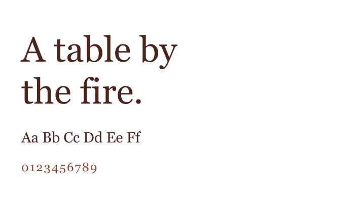

Fire. Form.
Italian warmth.
We enhanced Florencia’s existing identity with a refreshed logo mark, custom lettering and typography, then extended the system across menus, packaging and collateral.
The original Texas-Italian character guides the refresh: expressive lettering, warm colours and tactile materials connect the identity from the table to takeaway.
New imagery and applications are illustrative portfolio mockups. Menu items and sauce flavours are concepts, not verified offerings.
Custom lettering balances an ornamental crest. The same F appears in both, giving the full signature and smaller applications a consistent character.

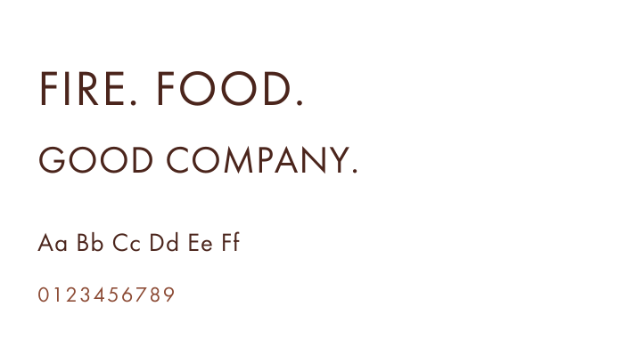
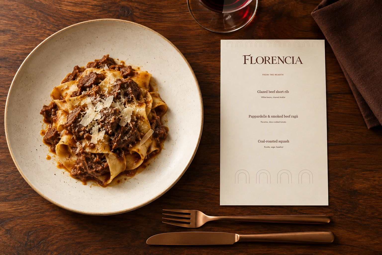
Sauce brown and cream set the tone. Georgia brings warmth to menu titles; Futura PT keeps labels and smaller details clear. Custom lettering gives the logo its own voice.
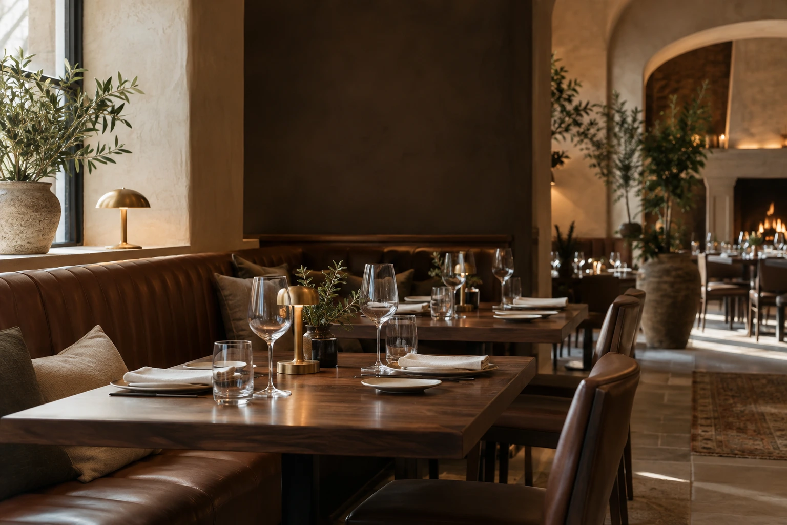
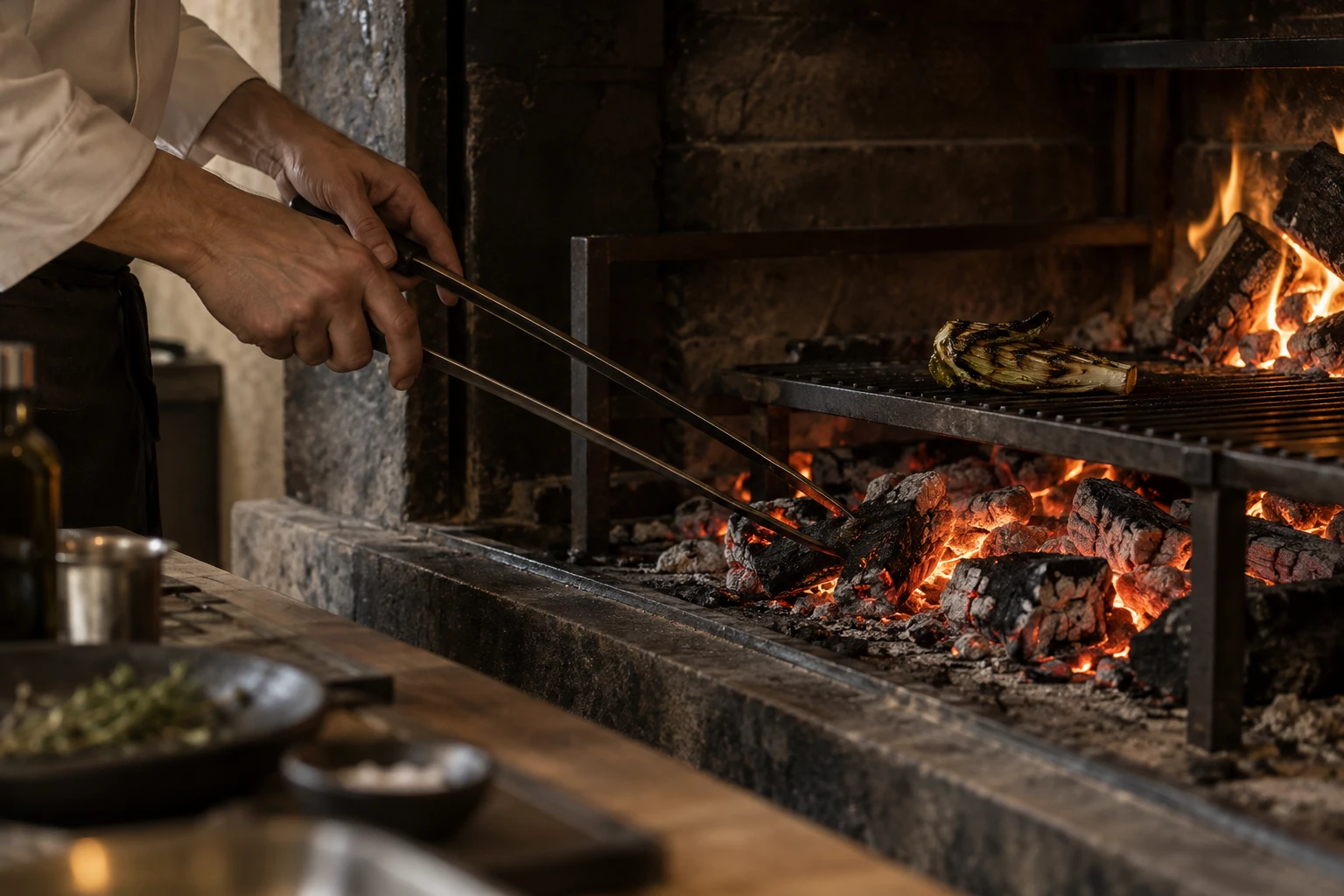
Fire, food and tactile materials give the identity its setting.
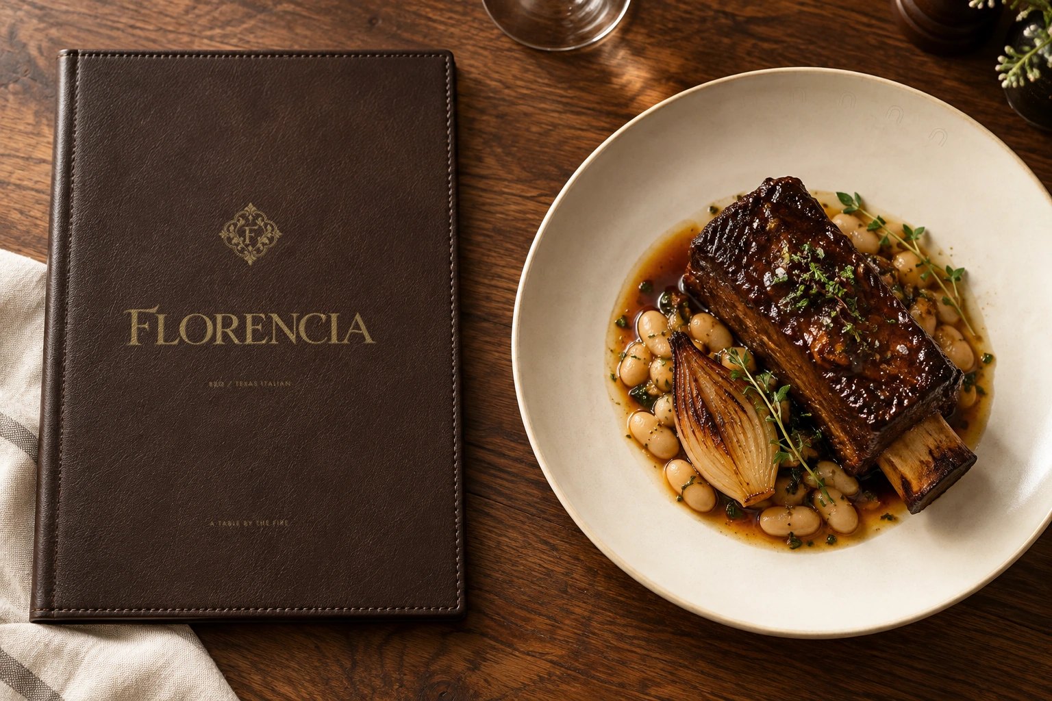
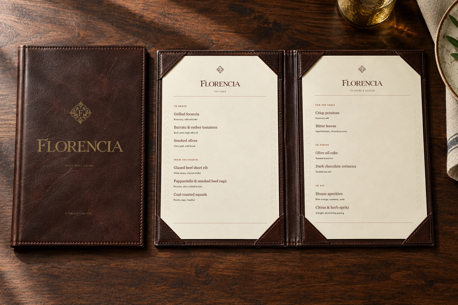
Stitched leather, softly impressed gold and cream inserts translate the identity into a tactile menu concept.
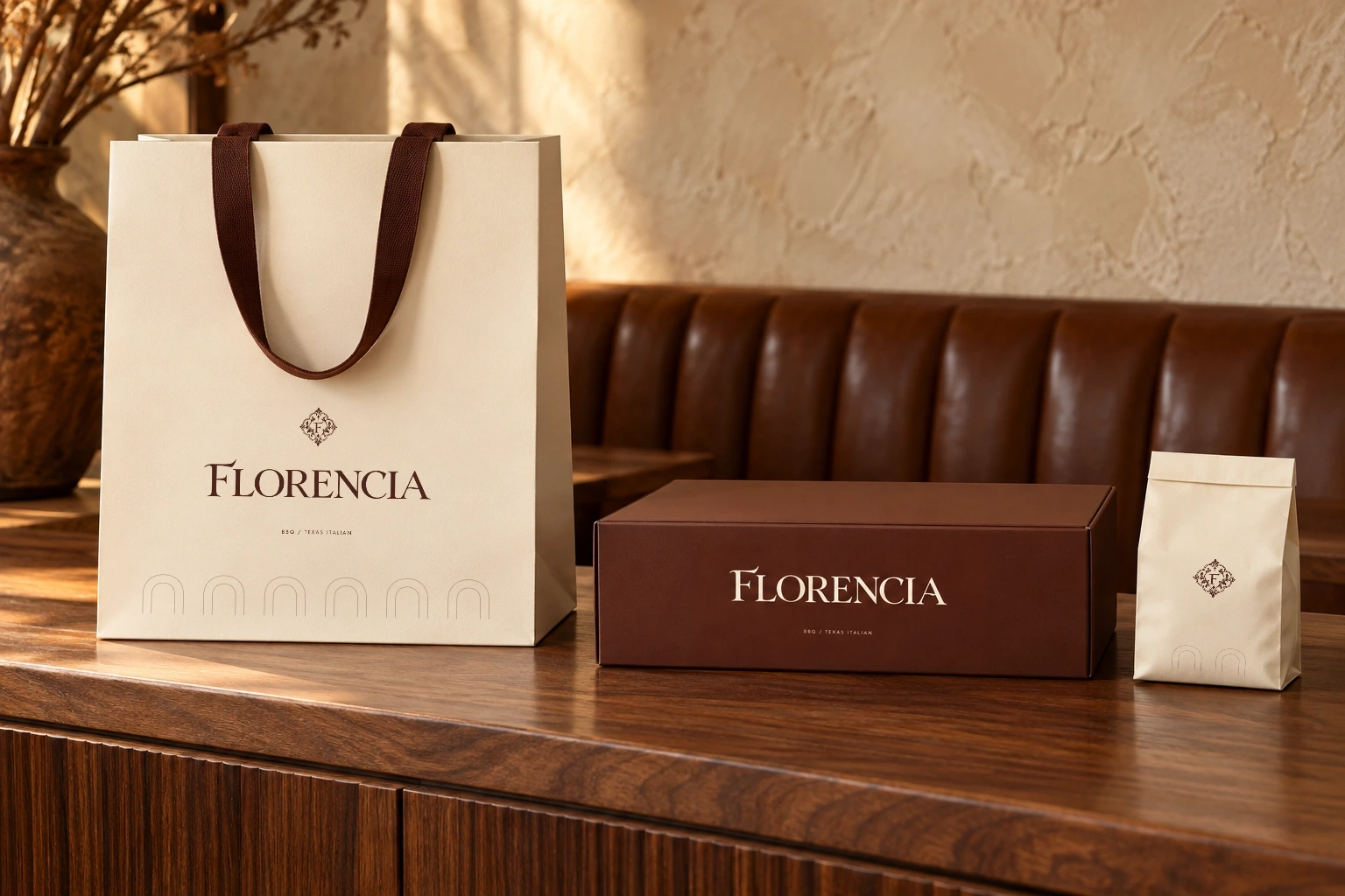
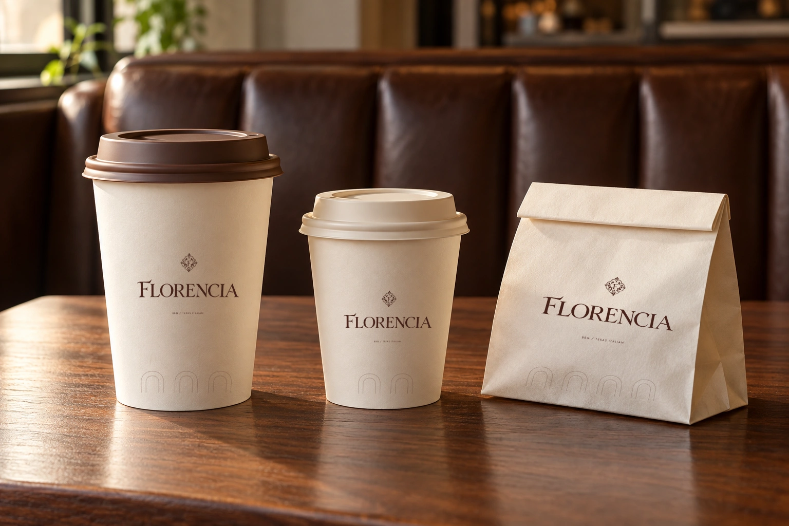
Cream paper, sauce-brown finishes and considered proportions tie the packaging family together.
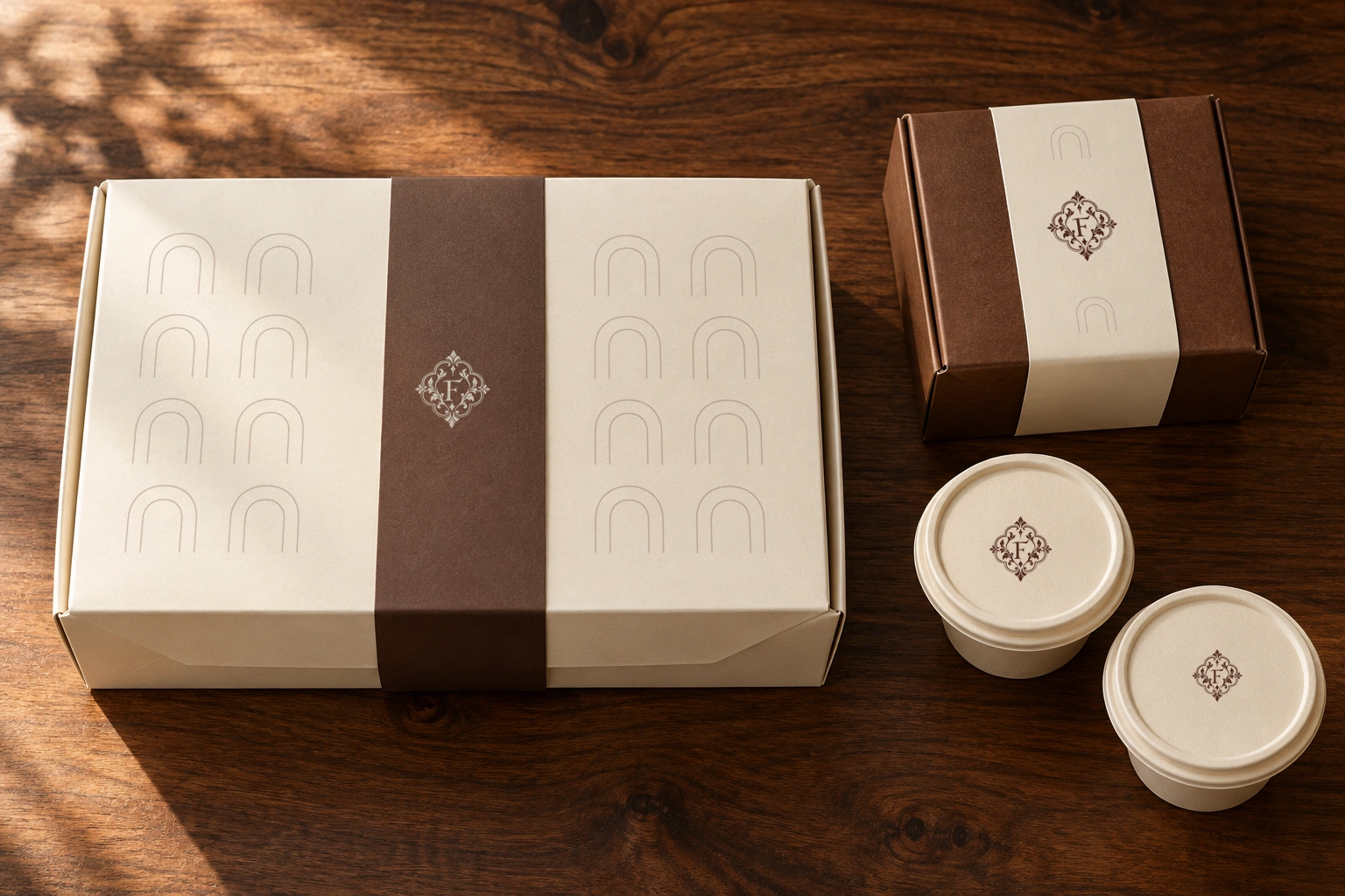
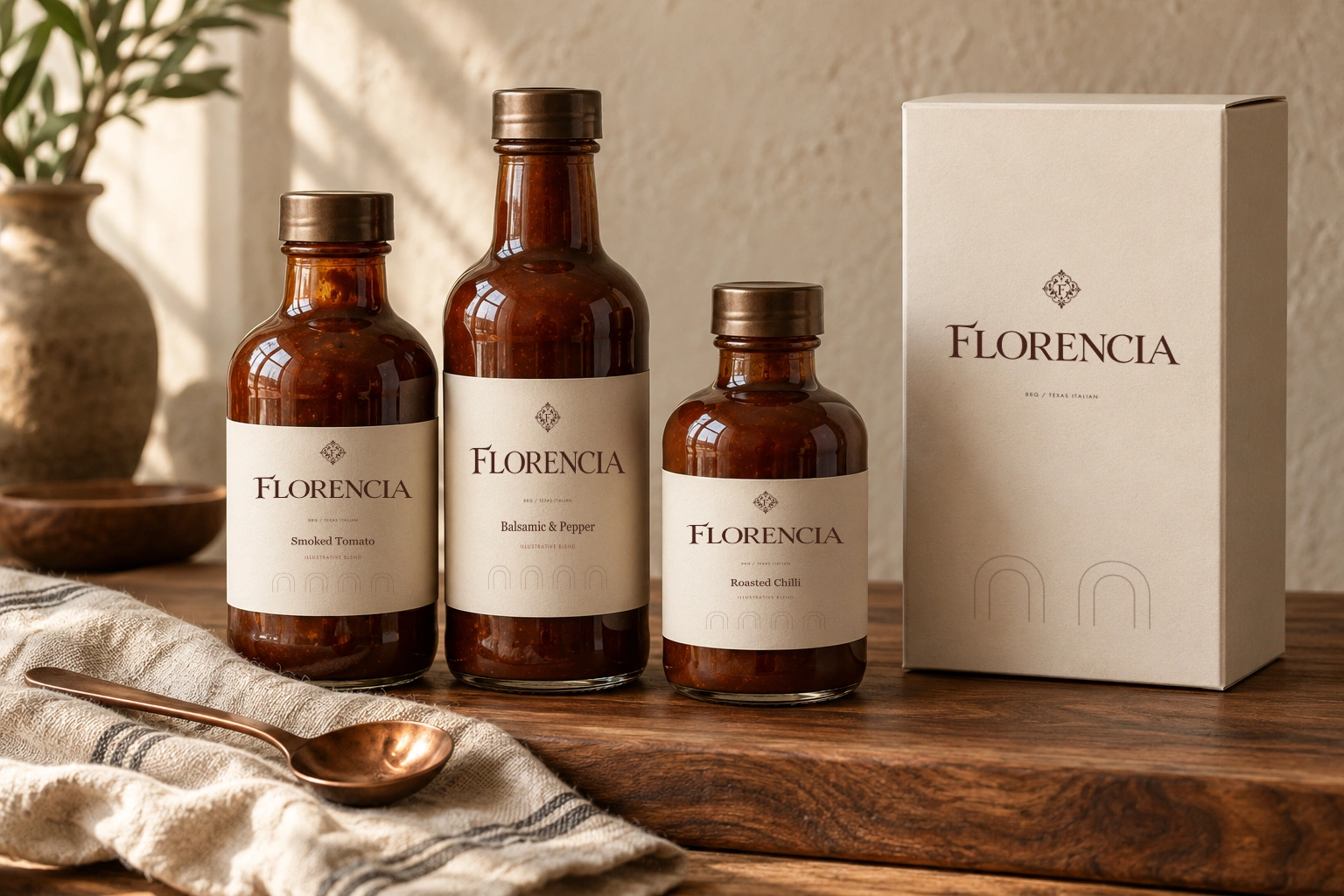
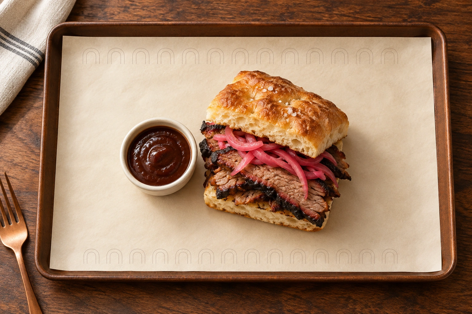
A repeat of nested hearth arches adds a quiet signature to tray paper, with open space around the food.

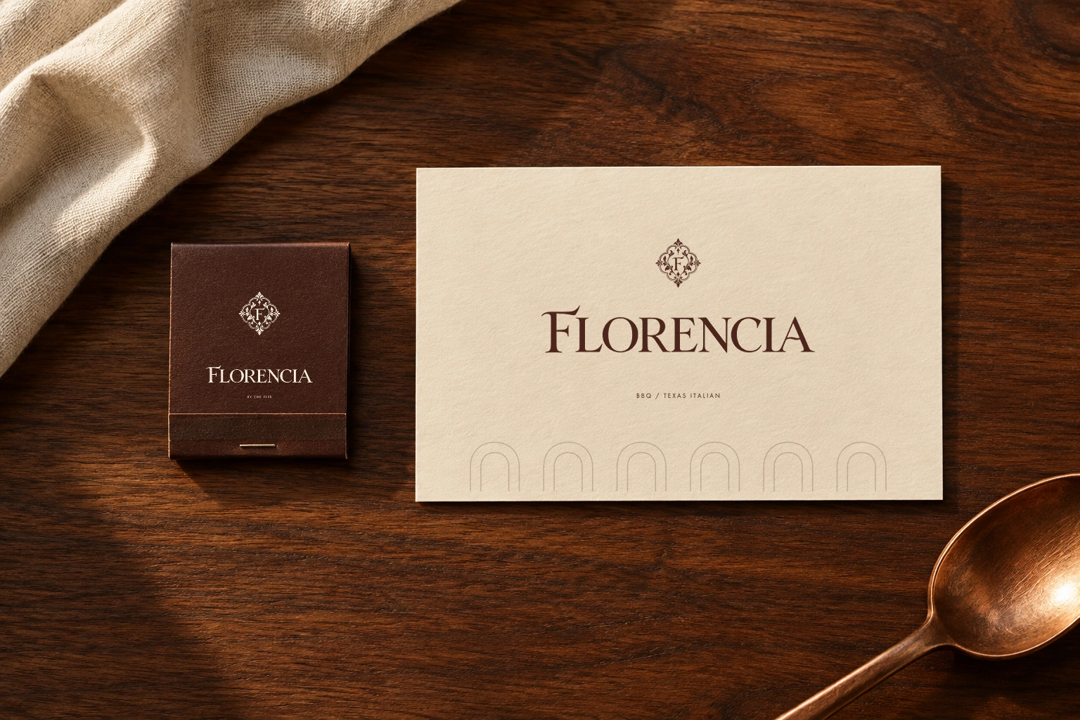
The crest anchors a compact matchbook; the full signature gives correspondence a more generous expression.
A new identity or a thoughtful next chapter. Tell us what you have in mind.
Start a project