
Dark Brew
Identity, packaging & marketing
Distinctive character. Consistent expression.

Familiar character.
A fuller expression.
Packaging applications
Supporting graphics & marketing
Dark Brew Coffee House began with Gregory Berg’s client identity. This presentation explores its character through lettering, packaging and marketing applications.
Editorial lettering and the four-bean emblem anchor the identity. Espresso, kraft and cream give the packaging and communication a shared starting point.
The original character, intact.


Studebaker / Identity & display lettering
Lettering with a supporting cast.
Studebaker gives the identity its character. Gilroy keeps short descriptors clear, while Alegreya brings warmth to longer passages.
Details with a family resemblance.
Our approach balances bold lettering with tactile detail. Connected coffee botanicals, a concentric seal and emblem-led rules bring consistency to broad surfaces and small printed accents.






Character you can carry.
Wine, forest and kraft distinguish the packaging range. Shared logo placement, numbered roast details and tonal botanicals keep each application part of the same family.

A familiar mark.
A tactile surface.
The logo leads on the front. Forest, kraft and wine cups share a continuous botanical wrap, with connected branches moving around the surface and quiet space around the identity.

One atmosphere.
Across the touchpoints.
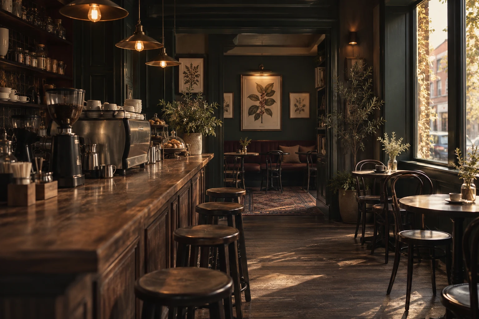
Menu, printed details and signage bring the same identity into an imagined physical setting.


Made for the moment.
Café atmosphere and takeaway details lead two short-form campaign directions. Restrained identity placement keeps the focus on the imagery.


Short-form direction / Film


Short-form direction / Film
A fuller expression of Dark Brew.

Editorial lettering and the four-bean emblem lead; tonal coffee botanicals connect cups, bags and printed details. Espresso, kraft and cream give the presentation its warmth, with forest and wine adding depth.
Back to selected work ↗